Does ‘discount’ have to look cheap?
Stuart Geekie, Managing Director at HMY Group (UK), discusses how discount retailers can compete with the multiples when it comes to store design
Whether it’s a two-for-one deal at our favourite restaurant or a special introductory price for the latest gadget, there’s no doubt that we’re a nation of bargain lovers. We love to boast about how we’ve managed to shave pounds off our weekly shopping bill and delight in shocking friends and family with how little we’ve spent on a delicious bottle of wine or must-have home accessory.
So, it’s no surprise that the discount retail sector is truly booming at the moment. Data from Kantar Worldpanel this month highlighted that the Big Four supermarkets all lost market share recently, as discount giants Aldi and Lidl continued to flourish. Aldi saw sales increase by 13.4%, while Lidl’s grew by 16%. This isn’t to say the major players like Morrisons and Sainsbury’s are failing, with the former seeing a 2.8% increase, but it’s a clear indication that the discounters are not going anywhere; rather, they are more present than ever before.
Much of the reasoning behind the discounters’ success story is down to a real shift in consumer behaviours and perceptions. The traditional ‘weekly shop’ has become almost outdated as our preferences and, indeed, our lifestyles change – for example, shoppers are much more savvy and will head to various separate outlets to pick up their essentials, eager to get the best possible price and variety. However, there are of course misconceptions still hanging over the discount sector and much of this lies in beliefs around the shopper’s in-store experience and brand loyalty. So, how can discounters polish up their stores to compete with the Big Four?
Get the look
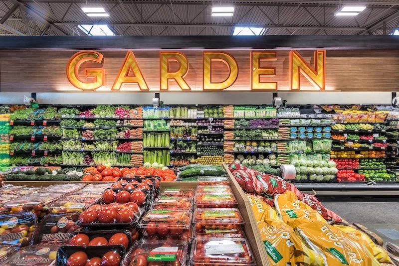
When it comes to grocery shopping, most people will want to whizz through the aisles with their trolley and tick off their list as quickly as possible, so making the in-store experience as slick and as uncomplicated as possible is essential. Retailers should steer clear of the ‘junk sale’ look that is often associated with such stores and, instead, take inspiration from the multiples. Overhead signage will make it crystal clear to shoppers where they can find each item on their list and they’ll be able to see at a glance where they need to head next.
Avoiding the ‘stack, pack and rack’ theory is also key – high shelving can be overwhelming for shoppers and could also mean that quality stock is missed due to being out of reach and out of sight. Instead, consider ‘capsuling’ ranges to pick the most popular and relevant items for customers, therefore saving the need for super-high displays.
A touch of tech
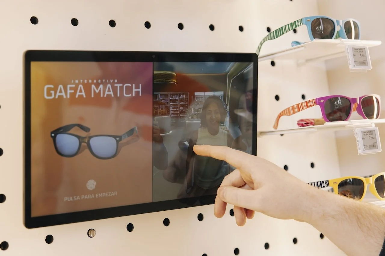
It may be a slightly more traditional way of thinking, but the phrase ‘eye-line is buy-line’ is still very relevant in today’s market. As such, technology can be used to shake this up and draw shoppers into a specific range or product category on the shelf. For instance, virtual reality (VR) is beginning to find its way into the early stages of store design and there’s no reason why discounters can’t grab a slice of the action, too. This technology allows us to see a proposed shop floor layout as it’s being designed, giving both retailers and suppliers an insight into what the shopper will see and feel.
Discount retailers should also think about the pull of online shopping and why consumers may choose to shun the store in favour of the web. Introducing mechanisms like ‘click and collect’ will give shoppers the ease of online shopping and a clear similarity to the bigger multiples, while bringing them into store to, hopefully, build trust with the brand.
Whether it’s a store makeover or simple tweak to store fittings, remember to keep the consumer’s needs in mind – they’re visiting your store for a reason, so give them a reason to come back and share their experience with others.


